WHY THIS PRINT?
The silk fabric for the dress was created from a print of a favourite painting of mine called “SISU”. The painting was created with reflection upon the feminine and our capability to be both wildly daring and sensitive.
I intended to visually communicate this incredible duality of strength and vulnerability through the contrast of strong, fluid shapes which move between each other, surrounded by a supportive void of negative space. The seemingly opposite or contrary forces complement each other, they are interconnected and interdependent. Strength gives rise to vulnerability and vulnerability to strength.
The word SISU conveys so beautifully this ability to be bold, resolute, strong like a mountain, whilst equally full of equanimity, calm and composed and with great presence of mind.
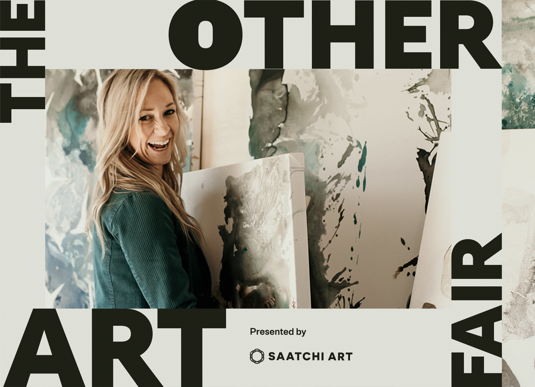
We’ve been so busy here at Pastiche HQ, that we have invited one of our favourite local designers, Cindy Vogels, to be our guest ‘Creative Director’ for our newly upsized winter edition. We procured some time with Cindy post ‘the shoot’ to chat about how the inspiration came about for this vibrant project.
Firstly, you shot this in record time, in only half a day I understand?
Yes, but we had put plenty of hours into preparation, and if Amica Whincop and I actually counted how long we’ve been stewing this idea on the back burners, it could be up to two years. This meant that we were incredibly efficient as soon as we got the green light from Joolie Gibbs (Gallery Director) and Sandra Ross (Education and Public Programs Officer) at Gympie Regional Gallery.
Tell us how Gympie Regional Gallery became the backdrop?
I had recently attended the Gallery’s 20th birthday party (which was fabulous and costume-themed), and soon after I was talking to Skye (from Pastiche) about the cover. Amica and I had already shot a pilot for this signature collaboration and we were having fun developing it. For the pilot, we had ventured into the Queensland bush, but now felt like an indoor shot was required. Our local Gallery seemed like a grand choice.
Tell us about the preparation work after the Gallery location was agreed upon?
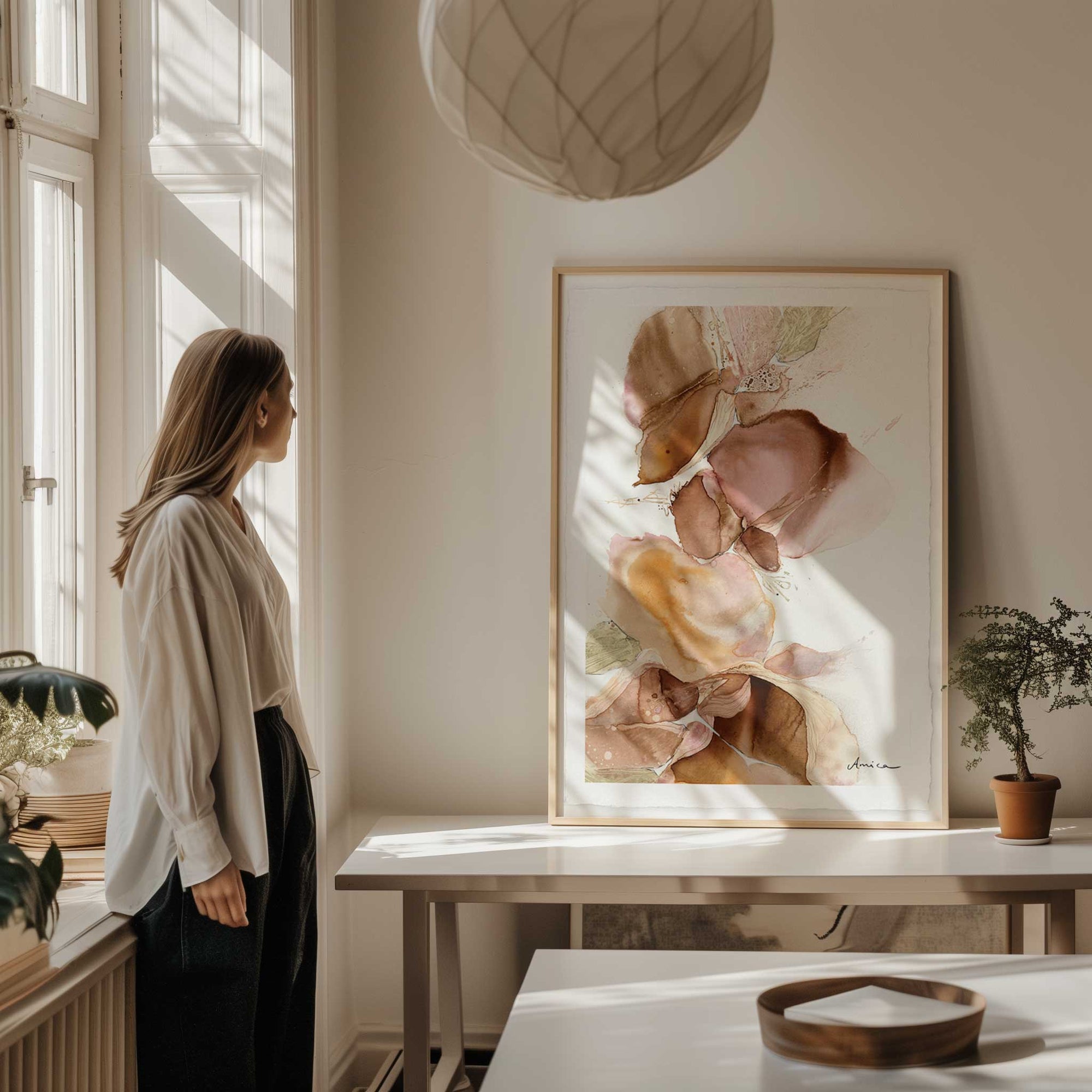
We needed to pick one of Amica’s works, so we let Skye choose from eight different pieces; all of them were equally vibrant and dreamy. (I couldn’t choose). Skye immediately chose a favourite, and Amica then set about translating her work onto the perfect fabric for me to work with via sublimation printing.
This was no simple task – if you’ve seen the size of some of Amica’s works in real life you’ll understand. Lucky she’s also a graphic designer and handy with a camera!! It was a cool moment when she called many weeks later to invite me around to see the fabric for the first time. After Amica had created the fabric, it was up to me to turn it into a wearable design.
You love collaboration. Besides the Gallery, who else joined you on this creative adventure?
The gorgeous Layla agreed to be our statuesque model and when Skye’s favourite photographer (Richard Waugh) couldn’t make the set date, I begged Amica to ask her son Finn to jump in. He has captured some great content for me before, and I love having young eyes and minds in the mix. It’s just the right thing to do, sharing creative opportunities with the younger generation. We also got word to Gympie Living magazine, and their feature writer Kate worked up a stunning behind the scenes story to highlight the local collaboration, and push out some good vibes and hype prior to the Pastiche edition reveal.
Taking a step back, how did you and Amica meet?
Well, when my family first moved from Buderim to Gympie, Amica was the ‘favourite’ art teacher at my kid’s school. Through my passion for the arts and Amica’s obvious creativity and fun-loving personality, we were soon friends. We have worked creatively and collaboratively together through various art projects, and with Amica helping me design and develop my company logos over the years. We bounce ideas off each other and have a creative flow together that I really enjoy.
Symbolism:
Mountaintops represent the state of full consciousness, equanimity and resilience.
Colour psychology:
-
Lilac- sacred, spirituality, feminity, grace & elegance.
-
Blue – trust, loyalty, wisdom, confidence, faith, truth & heaven,
-
Grey – intellect, knowledge & wisdom – perfect neutral that lives in between the extremes of black & white.
Original Artwork for design:
SISU, 153 x 76cm. Ink, acrylic, aerosol & enamel on canvas.
SISU was created with reflection upon the feminine and our capability to be both wildly daring and sensitive.
I visually communicate this incredible duality of strength and vulnerability through the contrast of strong, fluid shapes which move between each other, surrounded by a supportive void of negative space. The seemingly opposite or contrary forces complement each other, they are interconnected and interdependent. Strength gives rise to vulnerability and vulnerability to strength.
The word SISU conveys so beautifully this ability to be bold, resolute, strong like a mountain, whilst equally full of equanimity, calm and composed and with great presence of mind.